Good coloring is always about adding something to the image without distracting from it. It shall be there almost without being noticed. Like a good sundtrack to a movie.
But when I see a bad coloring job destroying a wonderful piece of artwork it's always a bit disappointing. And irritatiing because I know that it could have looked so much better.
Let me show you some examples.
(And I should add that I'm using some Disney comics as examples just because they clearly show my points and because I have them at hand in my studio. I'm not saying that these are the worst or best examples. It could just as well have been illustrated with Woody Woodpecker comics if I had any of those here. I'm using these images just to get my points across. )
This example comes from a Uncle Scrooge comics drawn by Daniel Branca. First I have isolated his black and white line art so you can see it the way he drew it.

Then we have the scandinavian coloring.
 Just flat tones. The artists lines is speaking and the coloring is there like the soundtrack mentioned above. No indications of light more than the shadow beneath Scrooge. No distracting elements in the panel. We read the balloon and moves on to the next panel. Artwork, coloring and text in sync.
 Then we have the US version of the same panel. Here every area has a gradient.

There is no focus and no reason. Just try to find the light source in the panel.
Branca drew a shadow but in this panel there seems to be one light source where the wall meet the floor, one beneath Scrooges beak and one above, one to the left thats shining on the object to the right etc.
There's just no afterthought or reason. The more gradients the better seems to have been the motto.
But sometime less is more I believe...
Our next panel from that story shows a bump. One version where the artwork tells the story and yet another where the color tries to add something unneccesary. (A green sky over a desert?)


Our third example is yet another idea about coloring and gradients. Thake a look at then second panel of the two.
Gradients and colors in the balloons??? The idea sounds bad and in my opinion it turned out bad too. Again: if there's no reason for a gradient why do it?


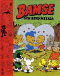
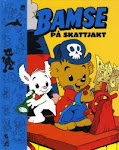
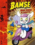
Next we have some covers. I've touched this subject before, see the post for March 3, 2008.
I have the same feelings for the two covers seen below as I have for the US Scrooge panels above. Looks like the colorist tries to add a "horizon" where the artist did none. (And I think the actual horizon line has been added to the Bolivar cover since there are versions without it.)
I believe that all of the covers below has been designed and drawn with the idea that the characters should stand out with one monochrome background color backing them up.


Compare the two first above with the two american covers below (drawn by Daan Jippes).


See how much clearer they are? The focus is on the gag and the artwork. Shadows has carefully been added to the areas where they are needed. A beautiful coloring job that I unfortunately have no idea who did.
The same goes for the cover below.

Just look at how carefully the shadows and highlights has been applied. This coloring job is also filled with different gradients and "shadow colors" but is the direct opposite of the Scrooge panels above. This colorist is aware of what he or she is doing and applies his/her skills to the artwork without destroying it. Instead the combination of the two becomes greater than the parts IMO.
Remember what I wrote in te beginning? "Good coloring is always about adding something to the image without distracting from it." And thats exactly what's done here and on the two MM and US covers above.
But maybe I'm totally wrong? Let me know your opinions!
To round off this post I just have one more cover for those of you who thinks gradients and horizons are neccesary to make a successful cover.

Nice, eh? ;)


14 comments:
Interesting. So I talked about you at www.afnews.info today. :-)
gg
Hi, I'm a freelance colorist from Denmark and I totally agree with you. Too many comics are ruined by bad/wrong coloring!
VoBo
Hey, Joakin! Take a look at those gorgeous brazilian covers from the 80's:
http://www.papersera.net/vilaxurupita/mg/mg001_025.htm
It uses almost no gradients, but it has an impressive inking working that works perfectly with flat colors.
Joakim, I respectfully disagree. But my view has more to do with emotions than opinions.
I grew up with the pastel-colored Disney comics of the fifties. I read the wonderful stories by Carl Barks and Paul Murry, and the panels were not drawings to me. They were windows into the fantasic world of Duckburg.
Then, in 1962, the Norwegian publisher switched to the modern, stronger colors. The panels became much clearer – in fact, too vivid for me. Suddenly, I started noticing the ink lines, and discovered many small errors in the coloring. The illusion was lost.
Since then, printing methods have improved tremendously. But the clear, flat colors still bother me. I was disappointed when the Carl barks Library in Color chose to make only limited use of gradients – while mostly keeping the flat coloring (although the colors were very tasteful). I even borrowed some colored pencils from my kids and added shading BY HAND to some of my favorite stories – to try to soften the crispness of the panels. I liked the result.
Then along came Gemstone with their gradient coloring. I liked it, and started buying their books although I had read almost every story. The gradients colors went a long way in restoring the softness in the panels that I remembered from my childhood. Yes, they do make the ink lines less clear, but they make the drawings seem more real – more alive. Of course, I would prefer that the colorist “lit” the scene correctly, but even a more random use of gradients work for me.
This may not make much sense to a lot of people, but like I said in the beginning: it has to do with feelings, and of course nostalgia. I want to recreate the “real” Duckburg of my childhood.
BTW: I draw a comic strip, and before sending a strip to the newspaper I use a slight blur effect so that the ink lines will not be too visible. I also use gradient coloring, and the result looks very nice in print.
After all, the world is not flat-colored.
So sorry to hear that you think my work has "destroyed" that Scrooge story.
When I started coloring Disney books for Gemstone, I was trying to emulate a style closer the American Disney product/DVD box art, which is usually airbrushed.
In America, comics coloring is much more elaborate than it is overseas. Some would say overdone, yes, but flats are seldom seen in mainstream books despite the style. Gemstone's Disney books share shelf space with books from Marvel and DC.
They're also *much* more expensive than many of those books. So consumers will have certain expectations for how the book *should* look when stacked up against, say, the latest issue of X-Men. Especially for the price.
Again, I'm sorry to hear that my work on those books isn't to your liking. However, nearly everything I worked on was a reprint, so I'm sure you can find a version more suited to your tastes.
However, feedback is always a good thing -- positive or negative. At least I know people are *seeing* my work, aye? ;)
Take care and all the best.
-- Kneon Transitt
I must say that I totally agree with you Joakim. I really hated the coloring in the earlier books in the Barks Collection... There are a lot of computer colourists out there that uses gradients like they first encountered a new toy in photoshop, and a select few who knows what they're doing and uses gradients like they should: to enhance the comics with subtlety.
Fernando: I like those Brazilian covers. Maybe a bit too strong colors for my taste, but very effective.
Nils Petter: Is your strip available on the net? I've never heard of anyone blurring the inked lines on purpose. Would be interesting to see what it looks like.
Kneon: Glad that you didn't take it too personal. I just scanned some panels from a story I had two versions of. And after reading your explanation I see why your coloring choices were made.
"Steamboat" (Bror):
If you dislike the early volumes of the Carl Barks Collection you would have disliked the early versions of them even more.
The first version had so much gradients you can't imagine. Even the logos had gradients and several colors in them!
The colors were then partially flattened by request from the sewdish editors, but still much of the unneccesary gradients were left.
The coloring caused a hot debate here in Scandinavia where Egmont was accused of using bad coloring with too much gradients.
What very few knows is that he coloring comes from USA! So Egmont shouldn't really be blamed for this. They did what was possible to "rescue" the coloring in very short time close to deadline.
So for those of you hoping that a future Gemstone edition will be better: well if you like gradients you should wait for the that edition. if you don't like gradients you should let them know before the sets are printed.
Joakim, you can look at my strip at http://www.nettserier.no/hakkum.
So far, I have posted 602 strips. All in Norwegian, but one of my autumn projects is getting an English version on the net. In the newspaper, the strip width is 24,4 cm, ie. quite large. The blurring makes the lines look smoother in print. Since I use bitmap, there is a slight "staircase"-effect if the lines are reproduced unblurred.
Well... Yes... If the first volumes of the Carl Barks Collection had been that much worse... I would have cancelled the subscription after the first set.
Nils Petter:
Okay, usually the backgrounds seem plain, though. Any books produced, since it seems to be more than 600 strips not published online?
I think the gray background in the later strips is too dark, though, and the house milieu looks too artificial.
Håkan:
The strip has been published in the Norwegian anthology "Fleip 1-6", but only in B&W, which doesn't really do it justice. I draw it for my local newspaper Moss Dagblad, and the colors are a compromise to get the best possible result from newspaper printing. As a result, the on-screen colors sometimes look odd. I am working on a special on-screen version using Flash, but there is never enough time ....
The backgrounds? Yeah, I know. I HATE drawing backgrounds.
Thanks, I try to remember adding the info to the Swedish Seriewikin. Our coverage on the Norwegian scene is somewhat lacking...
It's something that's been on my mind for a while now. I look at a lot of new comics covers and the richer coloring puts me off. It's a turn off and I don't even want to look inside them.
I agree with much of your points, Mr. Gunnarsson. Personally I’m disinterested in painterly effects; they work well in single images, as paintings, as posters, fine, you can take it all in at a glance but with narrative sequences, panels of art, it seems overwhelming. This also seems to be the case with CGI comic book art--I somehow lose interest in the story altogether. I'm not speaking of Dore-like details in black and white.
I bought Moebius’s Incal collection thinking it was in black and white, the first issues, and I lost interest in the art immediately because of all this computerized coloring, there was just too much to look at, it also seemed murky. But computerized or hand painted, it’s too much, maybe it’s like museum fatigue. It’s like small painted canvases stuck together on a page.
I'm reminded of Barry Smith's romance of a pensive knight lured into a wall by a femme fatal, beautifully done in colored pencils and ink, maybe water colors, too, but somehow the artfulness of it was too much, unnecessary. The line work in black and white would've been fine without the color. It was as if each panel was an elaborate stain glass window. And I remmeber Beck's comments on Smith's work but it's not that such realism can't work, in this case, it was the coloring but Beck's points are related to this question.
For me black and white works best or the simpler four color limited coloring of the past. I liked the coloring in the Marvel editions of Moebius 'work, though painterly it was limited in scope, and also what I've seen of 60s Blueberry.
Also I’m thinking maybe it’s not just a matter of it not being done well, done well or not, too much painterly effects slows the reading of the art and it ought to be a rule perhaps that the simpler coloring or black and white is the best approach for readability, for visual narrative storytelling—the Incal looked murky in contrast to the black and white version I saw in the Comics Journal years before. I'd rather read the black and white version, if I could buy that. Black and white reads faster, you take in the visual “meanings” of panels quickly. The coloring technique draws too much attention to itself as pretty or clever?
One solution is to separate the panels, two per page, so it's easier viewing? You can linger on the details more. So there isn’t this crowding. When my eyes scan a number of panels on one page I pretty much take in all the action before I start reading the text and this diminishes suspense, in comics a bit. You already know some of what is happening before you start reading. Real simple black and white line art reads too quickly, the opposite problem?
When I flipped your examples back and forth the simpler colored version, after the black and white panel, hits you with an immediacy the more “artfully” colored ones don’t have—it some how lessens the impact of the situation with distracting layers of different colors that seem unnecessary, again, there simply to look pretty? Or is it a desire for realism? Now a lot of these crowded together would annoy me.
You're right, artists should put some careful thought into using the richer mixing that's at their finger tips now to help the story along rather than for the sake of prettyness? I don't see where the new coloring adds anything of value to the original panel.
Thanks.
Post a Comment